
PERSONAL BRAND / PRODUCT IDENTITY
DV Design
A brand system built to ship.
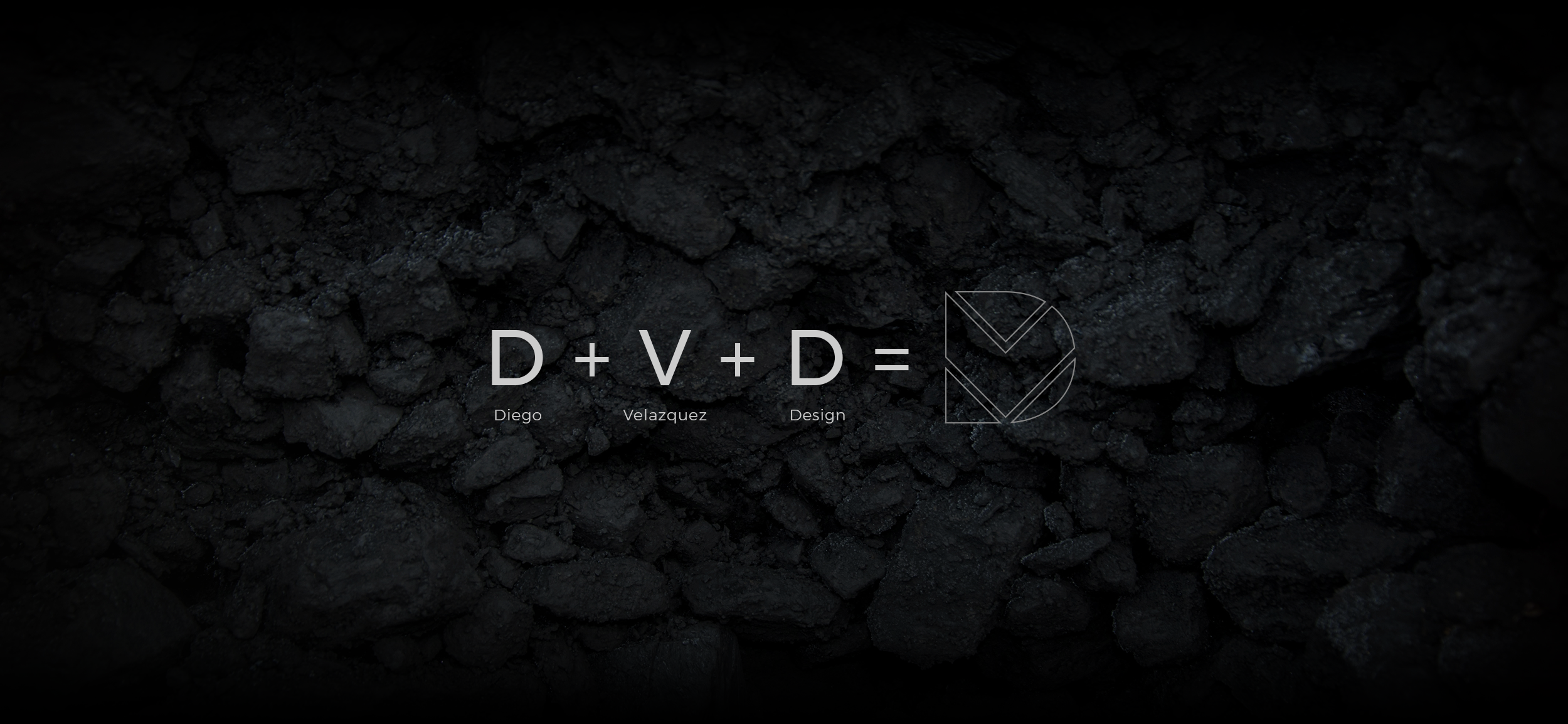
DV Design started as a foundational identity system created during my Advanced Digital Imaging course (GRA-420) at Southern New Hampshire University. Today, it serves as a living “product” that supports how my work is presented, understood, and trusted across touchpoints.
PRODUCT SNAPSHOT

Role
Design Lead
(Brand + Experience)
Owned concept, identity system, and touchpoint experience.

Audience
Recruiters + clients
Hiring teams, partners, and prospective clients.

Scope
System, not a logo
Mark, type, color, stationery, collateral, and web.

Platform
Digital-first identity
Designated to scale across web and print.
OVERVIEW
A personal brand that communicates clarity, craft, and credibility.

The goal was to create a cohesive identity system that could be consistently carried across professional artifacts and digital touchpoints. The system needed to feel confident, modern, and structured while remaining flexible enough to evolve with my career.
THE PROBLEM
Make the work easier to trust and easier to navigate.
Human need:
People scanning a portfolio want fast signals of credibility, quality, and focus. The brand must reduce doubt and help them understand what to look at next.
Business need
A consistent system improves recognition, reduces design rework, and supports better storytelling across materials and digital experiences.
USERS
Designed for high-intent decision-making.

Hiring teams need a fast read on craft, consistency, and seniority.

Clients/partners need confidence and clear next steps.

I, the operator, need a system that speeds delivery and scales.
APPROACH
Build a system that stays consistent under pressure.
Discover
Define the brand signal and the environments in which it must perform (web, stationery, leave-behind, portfolio).
Define
Establish identity rules that create consistency across grid, typography, color, and spacing.
Design
Apply the system across touchpoints and validate it through use.
KEY DECISIONS
The decisions that shaped the system.
01
Grid-first identity
Designed the mark using a clear grid to ensure consistency, scalability, and easy reproduction.
*Less freedom for variation, higher consistency.
02
Typography as a brand anchor
Chosen typography that supports clarity and hierarchy across print and digital layouts.
*Fewer type styles, stronger cohesion.
03
Limited palette, strong contrast
Defined a palette that supports legibility, confidence, and consistent brand recognition.
*Fewer expressive colors, clearer system behavior.
REFLECTION

A personal brand works like a product. It must remain consistent, reduce friction, and make the next step obvious.
Selected Works














Contact
Diego Velazquez
Email: diegovelazquezdesign@gmail.com
Web: diegovelazquezdesign.com
www.linkedin.com/in/dvelazquezdesign
Copyright © 2026 Diego Velazquez Design.
All rights reserved.