
UX WEB / RESPONSIVE EXPERIENCE
Palo Alto Soccer Club
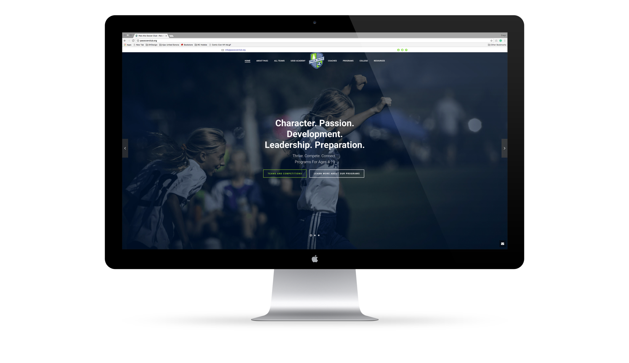
Built to scale with growth.
A responsive web experience designed to support a fast-growing youth soccer club, making programs, teams, and key information easier to find across devices.
PRODUCT SNAPSHOT

Role
Design Lead
(UX + Visual)
Led decisions across IA, navigation, and responsive UI.

Audience
Families, players, coaches
New prospects and current members.

Scope
Club web experience
Homepage, mobile, key pages, and supporting visuals.

Platform
Web + mobile
Designed for desktop, tablet, and phone.
OVERVIEW
A club with many programs. One clear front door.
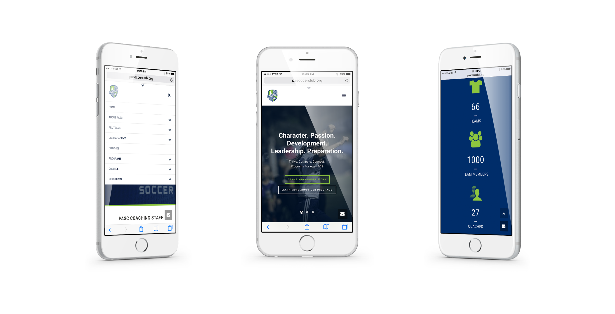
Palo Alto Soccer Club supports over 65 teams (U8–U18), plus academy teams, youth development (ages 4–9), supplemental skill academies, and summer camps. The site needed to present this breadth with clarity so families can quickly understand options and take the next step.
THE CHALLENGE
Make "many options" feel organized.
The club offers programs for all ages, at all competitiveness levels, and across pathways. The challenge was to reduce confusion for new families, keep returning users efficient, and maintain a consistent experience across desktop and mobile while the club continued to grow.
USERS
Designed around high-intent decisions.
Different audiences, same goal: find the right program fast.

Prospective families
Evaluate program fit and next steps.

Players
Understand pathways, teams, and development options.

Coaches and staff
Communicate consistently across programs and updates.
APPROACH
Structure first. Then scale the system.
I treated the site like a product catalog: clarify the pathways, define the structure, then design a repeatable responsive system.
Discovery
Mapped the primary program offerings and the questions families ask most when evaluating teams and development pathways.
Define
Translated offerings into clear navigation and page structure so users can move from “what is PASC” to “where do I fit” without hunting.
Design
Designed the responsive UI for desktop and mobile, keeping hierarchy consistent and scan-friendly across breakpoints.
KEY DECISIONS
The decisions that shaped the experience.
Three choices improved clarity, consistency, and usability across devices.
01
Responsive-first execution
Ensured the experience works cleanly across desktop and mobile so families can decide and act from any device.
Less room for device-specific flair in exchange for consistency and maintainability.
02
Homepage as an orientation layer
Used the homepage to quickly communicate breadth and credibility so users can identify their path into programs and teams.
Reduced emphasis on secondary content in exchange for faster navigation to top tasks.
03
Repeatable page system
Built consistent page patterns so information stays structured as offerings expand and content evolves.
Fewer unique layouts in exchange for stronger predictability and easier updates.
REFLECTION
Clarity is what makes growth sustainable.
This project reinforced a simple principle: when offerings multiply, structure becomes the product. Clear navigation, predictable page patterns, and responsive hierarchy reduce cognitive load and help families choose with confidence.

A club website succeeds when it turns complexity into a simple decision path. That is how you support families at scale.
Selected Works














Contact
Diego Velazquez
Email: diegovelazquezdesign@gmail.com
Web: diegovelazquezdesign.com
www.linkedin.com/in/dvelazquezdesign
Copyright © 2026 Diego Velazquez Design.
All rights reserved.