
WEBSITE / PRODUCT EXPERIENCE [ 2013 ]
Ajax Sonora
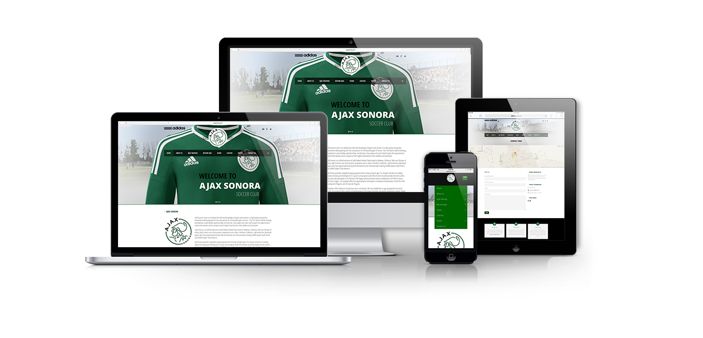
Built for families on the move.
A responsive web presence designed to help parents and players quickly understand an elite, year-round development program — and take the next step with confidence.
PRODUCT SNAPSHOT

Role
Design Lead (UX + Visual)
Led decisions across IA, navigation, and responsive UI.

Users
Prospective families
Current members, coaches/admin.

Platform
Responsive web
Desktop + mobile.

Scope
End-to-end experience
Structure, pages, UI patterns.
OVERVIEW
A clear front door to an elite program.
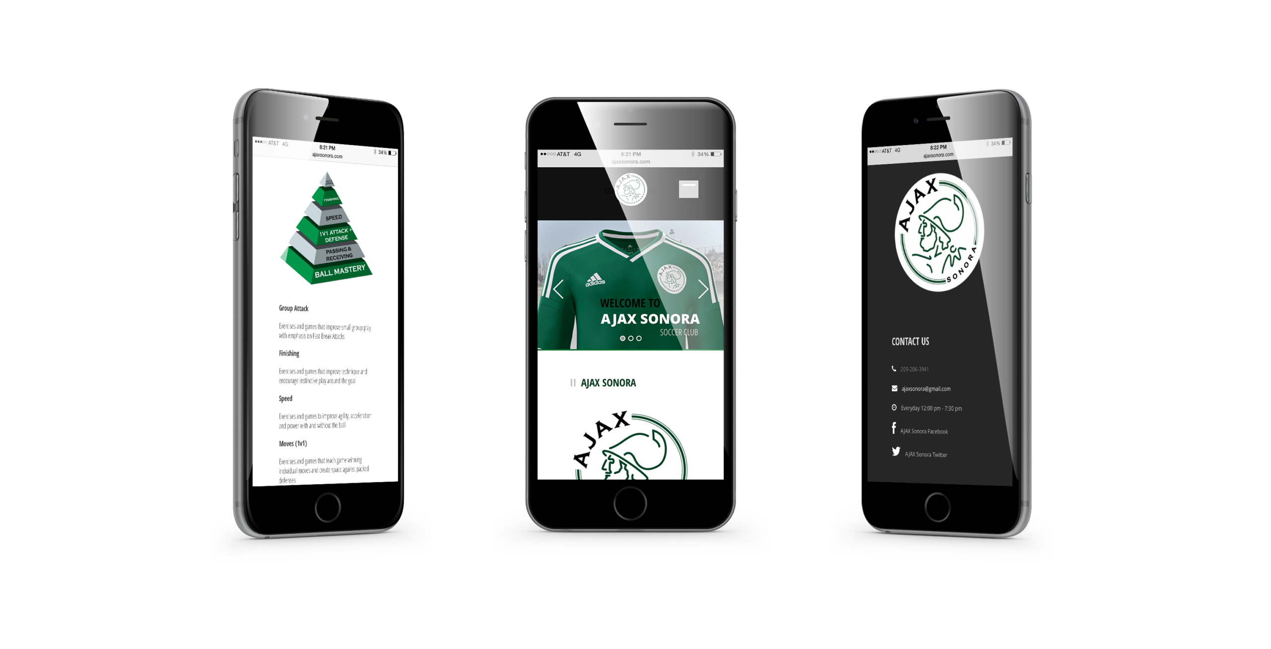
Ajax Sonora is an elite soccer club created to provide competitive opportunities for local players seeking advanced training and development in a year-round program under professionally licensed coaches. The site needed to communicate credibility quickly, reduce repetitive questions, and make it easy to explore training, events, and contact details from any device.
THE CHALLENGE
Answer the fundamental questions in less than 30 seconds.
User reality
Parents arrive with urgent questions:
“Is this the right level for my child?”
“What does the training pathway look like?”
“Who are the coaches?”
“When are events?”
“How do I contact you?”
Business reality
The club needs a premium, trustworthy signal:
Build legitimacy immediately.
Reduce friction in inquiry and enrollment.
Present a consistent story that coaches and admins can support year-round.
USERS
Designed around high-intent decision-making.
This experience supports two core user groups with one shared goal: clarity fast.

Prospective parents — evaluate program fit quickly.

Players — understand development expectations and pathway.

Coaches — present a consistent philosophy and structure.

Members — find events without digging.

All visitors — contact the club with minimal friction.
APPROACH
Human-centered, clarity-first.
I treated the site like a product: define the primary jobs, remove noise, and make navigation feel effortless on mobile.
Discovery
What families ask most
Mapped top questions and content needs to reduce cognitive load.
Define
Structure before style
Organized pages to mirror real decision flow: Program → Training → Coaches → Events → Contact.
Design
Calm hierarchy
Built a clean, brand-forward UI with strong typography and predictable patterns.
KEY DECISIONS
The decisions that shaped the product.
I optimized for clarity, trust, and speed—because families make quick decisions and revisit often.
01
Build mobile-first navigation
Made the menu and labels work perfectly on phones so key pages are always one tap away.
Less room for decoration; more focus on task paths.
02
Lead with credibility signals
Elevated legitimacy early—elite level, year-round development, and licensed coaches—so families feel confident before they convert.
Less emphasis on secondary stories; more emphasis on proof.
03
Structure before styling
Locked the information architecture first, so Training, Coaches, Events, and Contact match real decision flow—then refined the visual system for a premium feel.
More upfront planning; smoother experience long term.
REFLECTION
What I’d improve next.
- Instrument key journeys (menu clicks, contact submits, training page depth) to pinpoint drop-offs.
- Establish a simple content cadence for events/news with clear ownership.
- Convert repeatable patterns into a small component system to accelerate future updates.

In high-intent evaluation experiences, the job is not to impress users with complexity—it’s to make the next step feel obvious.
Selected Works















Contact
Diego Velazquez
Email: diegovelazquezdesign@gmail.com
Web: diegovelazquezdesign.com
www.linkedin.com/in/dvelazquezdesign
Copyright © 2026 Diego Velazquez Design.
All rights reserved.