
UX WEB / SCHOOL EXPERIENCE
Motherlode Christian School

Built for clarity and trust.
A web experience and supporting brand system designed to help families understand the school quickly, explore programs confidently, and take the next step toward enrollment.
PRODUCT SNAPSHOT

Role
Design Lead
(UX + Visual)
Led decisions across IA, navigation, and responsive UI.

Audience
Prospective families
Parents evaluating fit, current families seeking updates.

Scope
Web experience + system
Homepage, key pages, and brand consistency rules.

Platform
Responsive web
Designed for desktop, tablet, and phone.
OVERVIEW
A calm front door for a high-trust decision.
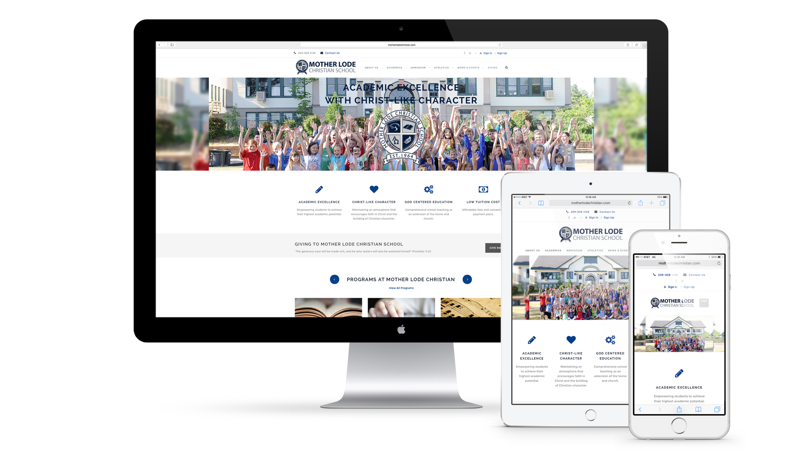
Choosing a school is emotional and high in consideration. The experience must reduce doubt, clearly communicate values, and make key information easy to find. This project focused on structured content, confident hierarchy, and a consistent identity system so families can move from interest to action without friction.
THE CHALLENGE
Make “everything important” feel organized.
School sites carry broad information for different audiences. The challenge was to keep navigation predictable, prioritize the most important tasks, and present content in a way that feels trustworthy and easy to scan, especially on mobile.
USERS
Designed for families on a timeline.
Different audiences, same need: find the right answers fast.

Prospective families
Evaluate fit, programs, and next steps.

Current families
Find updates, calendars, and key resources.

School staff
Communicate consistently and keep information current.
APPROACH
Structure first. Then strengthen the signal.
I treated the site like a product journey: clarify top tasks, define the structure, then design a repeatable system that holds up over time.
Discovery
Identified primary audiences and the most common high-intent tasks, especially admissions and key information families look for early.
Define
Translated those tasks into a clear information architecture and repeatable page model to keep the experience consistent as content grows.
Design
Designed responsive layouts and a calm hierarchy so users can scan quickly, understand the school’s value, and take action with confidence.
KEY DECISIONS
The decisions that shaped the experience.
Three choices improved clarity, confidence, and consistency across the site.
01
Prioritize admissions pathways
Made admissions and program exploration easy to locate and understand, reducing friction for high-intent visitors.
Less emphasis on secondary content in exchange for faster access to top tasks.
02
Build a repeatable page system
Used consistent templates and hierarchy patterns so users learn the site quickly, and staff can maintain it without design drift.
Fewer unique layouts in exchange for stronger predictability and easier updates.
03
Make trust visible through consistency
Aligned typography, spacing, and brand cues so the experience feels stable and credible across touchpoints.
Fewer stylistic flourishes in exchange for clarity and a more professional signal.
REFLECTION
Trust is built through clarity.
This project reinforced a simple principle: when a decision is high-trust, the experience must feel calm, consistent, and easy to navigate. Structure reduces cognitive load. Consistency reduces doubt.

A school website succeeds when it turns big questions into clear next steps and helps families decide with confidence.
Selected Works












Contact
Diego Velazquez
Email: diegovelazquezdesign@gmail.com
Web: diegovelazquezdesign.com
www.linkedin.com/in/dvelazquezdesign
Copyright © 2026 Diego Velazquez Design.
All rights reserved.