
UX WEB / RESPONSIVE EXPERIENCE
Sonora High School
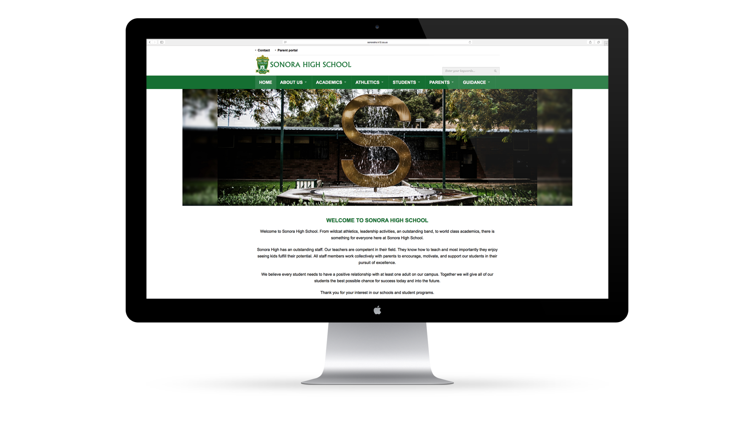
Clarity for a school community.
A responsive web experience designed to help students, families, and staff find what they need quickly, across devices, while reinforcing the school’s identity and mission.
PRODUCT SNAPSHOT

Role
Design Lead (UX + Visual)
Led decisions across IA, navigation, and responsive UI.

Users
Families & staff
Prospective and current community members.

Scope
Responsive site experience
Homepage, athletics, and key page templates.

Platform
Web + mobile + tablet
Designed to perform across breakpoints.
OVERVIEW
Information people can act on.
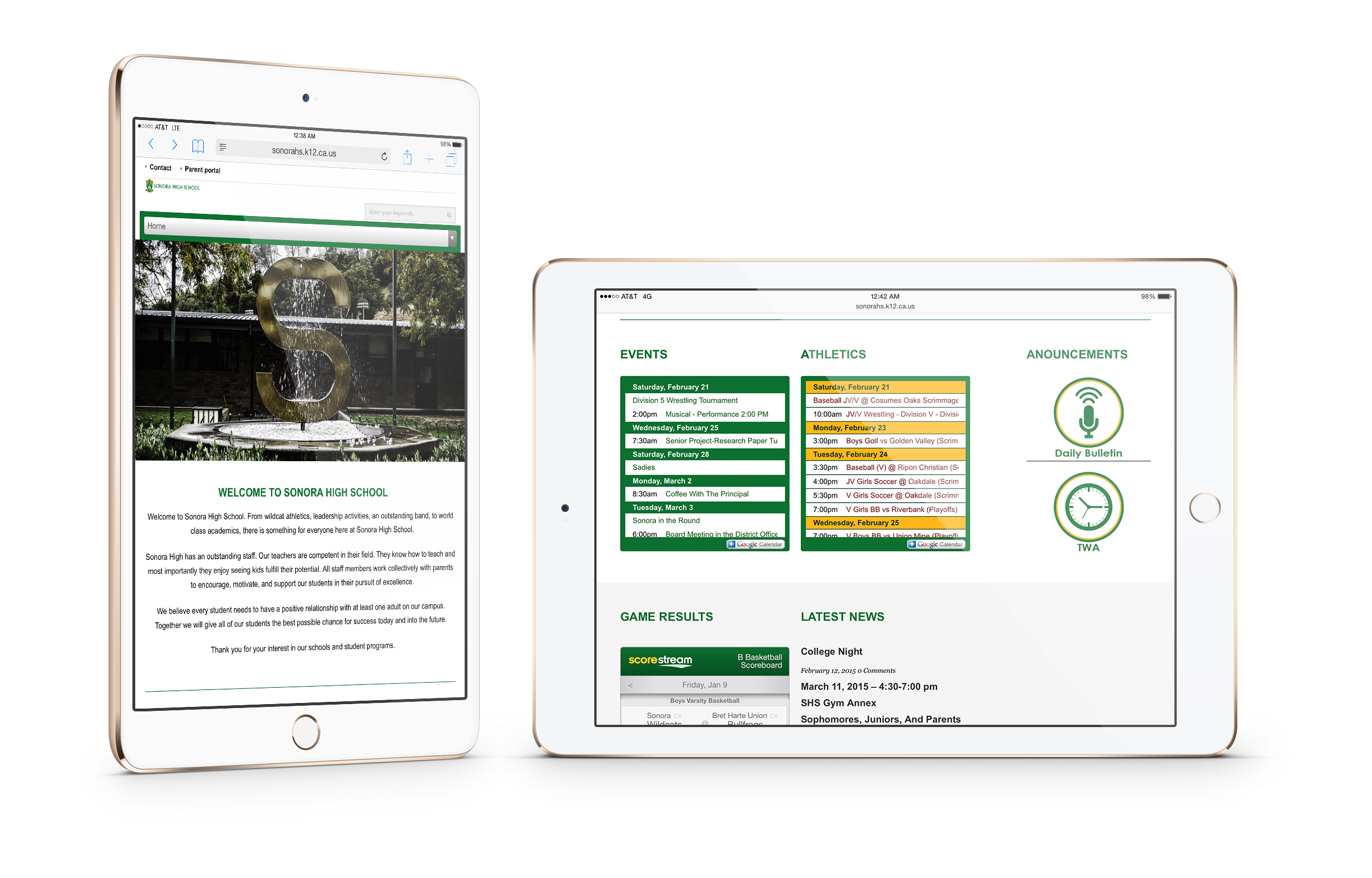
Sonora High School’s website needed to present a broad set of information clearly and consistently. The experience supports the school’s mission and helps visitors move from questions to confident next steps.
THE CHALLENGE
Make “everything” feel organized.
School websites serve many audiences and many tasks. The challenge was to reduce friction across common journeys, keep navigation predictable, and maintain readability across desktop, mobile, and tablet without overwhelming the visitor.
USERS
Built for quick scanning.
Different users, same need: find the right information fast.

Students
Schedules, activities, athletics, and day-to-day updates.

Parents and families
Key dates, programs, and contact information.

Staff and community
Resources, announcements, and school operations.
APPROACH
Structure first. Then polish.
I focused on clear structure across pages and breakpoints, then refined hierarchy and visuals to support faster comprehension.
Discovery
Identified the primary audiences and the most common high-frequency tasks that drive visits to a school site.
Define
Translated those tasks into a simple information architecture and a repeatable page model so the experience stays consistent.
Design
Designed responsive layouts for homepage and key sections, ensuring readability and navigation clarity across mobile and tablet.
KEY DECISIONS
The decisions that shaped the experience.
Three choices improved clarity, consistency, and usability across devices.
01
Responsive-first layouts
Designed key views intentionally for desktop, mobile, and tablet to ensure users get the same clarity everywhere.
Less opportunity for device-specific “showpiece” layouts in exchange for consistency and maintainability.
02
Prioritize high-intent sections
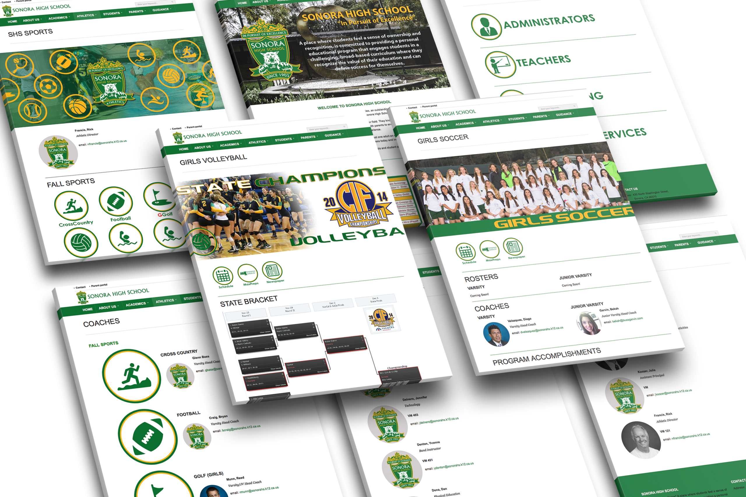
Elevated key content areas like athletics so frequent tasks are easier to reach and scan.
Reduced emphasis on secondary content in exchange for faster access to the information most users need.
03
Build a repeatable page system
Established consistent templates for interior pages so content stays structured and predictable over time.
Fewer unique page layouts in exchange for stronger consistency and easier future updates.
REFLECTION
A school site should feel calm.
This project reinforced a simple principle: when content is broad, structure must do more work than styling. Clear hierarchy and consistent page patterns reduce cognitive load and improve trust.

When information is easy to find, the community feels supported. That is the standard for any public-facing service experience.

Selected Works















Contact
Diego Velazquez
Email: diegovelazquezdesign@gmail.com
Web: diegovelazquezdesign.com
www.linkedin.com/in/dvelazquezdesign
Copyright © 2026 Diego Velazquez Design.
All rights reserved.