
BRAND / IDENTITY SYSTEM
Mike Suess Insurance

Trust, made visible.
A brand identity system designed to communicate credibility, clarity, and confidence for an independent insurance agency across real-world touchpoints.
PRODUCT SNAPSHOT

Role
Design Lead
(Brand + experience)
Owned concept, identity decisions, and touchpoint execution.

Audience
Prospective families
Individuals, families, and small employers evaluating coverage.

Scope
Identity system
Logo, palette, business card, stationery.

Platform
Print + digital-ready
Built to scale across collateral and future web use.
OVERVIEW
Confidence at first glance.
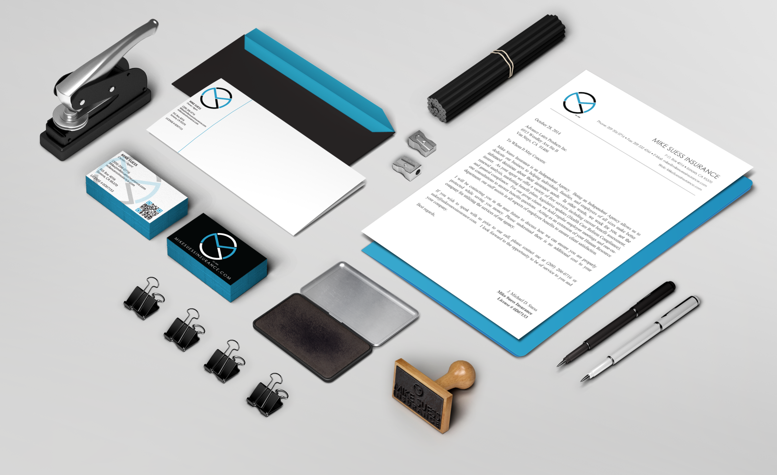
Insurance is a high-consideration decision. People scan quickly for stability and professionalism before they engage. This identity system was built to make trust feel immediate through a clean mark, disciplined color, and consistent application across everyday touchpoints.
THE CHALLENGE
Make credibility immediate.
The agency needed a brand presence that feels established and trustworthy the moment someone sees it. The identity had to be clear, professional, and consistent, while staying approachable. In this category, inconsistency creates doubt. Consistency builds confidence.
USERS
Designed for people who decide quickly.
Three audiences scan for the same signal: confidence they can trust.

Prospective customers
First impressions, then contact.

Families and individuals
Clarity and reassurance.

Small employers
Professionalism and cosistency.
APPROACH
A simple process that holds up in the real world.
I treated the identity like a product foundation: align on the signal, define the system, then prove it through touchpoints.
Discovery
Clarified the credibility signal the agency needed to communicate and where the brand must perform (print, stationery, future web use).
Define
Set the rules that create consistency: mark structure, typography hierarchy, spacing, and a disciplined palette.
Design
Executed the system across core assets and refined details for legibility, repeatability, and a professional finish.
KEY DECISIONS
The decisions that shaped the system.
Three choices kept the brand clear, consistent, and easy to trust at every touchpoint.
01
Final mark clarity
Chosen a logo direction that feels stable, professional, and readable across contexts.
Reduced stylistic variation in exchange for higher legibility and consistency.
02
Disciplined palette
Limited the palette to keep the brand calm, consistent, and easy to reproduce.
Fewer expressive colors in exchange for stronger recognition and reliable production.
03
Touchpoints prove the work
Applied the system to business card and stationery to confirm real-world usability and consistency.
More upfront refinement time in exchange for fewer downstream inconsistencies and rework.
REFLECTION
A brand should behave like a product.
This project reinforced a core principle: trust is built through consistent signals over time. A strong identity system makes the business easier to recognize, present, and choose.

A clear identity reduces doubt. It helps people make confident decisions, and it gives the business a system that remains consistent as it grows.
Selected Works













Contact
Diego Velazquez
Email: diegovelazquezdesign@gmail.com
Web: diegovelazquezdesign.com
www.linkedin.com/in/dvelazquezdesign
Copyright © 2026 Diego Velazquez Design.
All rights reserved.